Flexible Grid
 The flexible grid control allows you to divide a layout into multiple columns and rows in which you can place UI elements. You can also customize the grid by aligning and arranging your elements to suit your content. Since the flexible grid behaves responsively, it is suitable for both desktop and mobile devices.
Material Design's responsive layout grid adapts to screen size and orientation, ensuring consistency across layouts. The responsive layout grid is made up of three elements: columns, gutters, and margins.
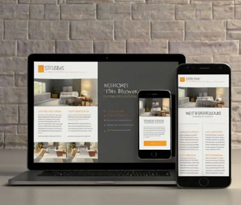
 The flexible images are responsive web design's second pillar. They allows us to provide image solutions with no restrictions to a fixed display size. The flexible images, often also called adaptive images. respond to different viewport sizes and display resolutions.
 Media queries are simple filters that can be applied to CSS styles. They make it easy to change styles based on the types of device rendering the content, or the features of that device, for example width, height, orientation, ability to hover, and whether the device is being used as a touchscreen.
 The navigation elements of a responsive Web site are of vital importance, because the quality of the user experience is largely dependent on them.
 Responsive Websites offer all these prefered factors for an enhanced SEO ranking; these websites can change their code elements, content and audios/visuals embedded according to the viewing environment, reducing the response time significantly. Since these can adapt to a wide range of varying mobile handsets, they tend to be more mobile friendly.
 Maintaining a separate mobile site requires additional testing and support. In contrast, the process of responsive design uses standardized testing methodologies to ensure optimal layout on every screen. Having separate desktop and mobile sites also necessitates two content strategies, two administrative interfaces and potentially two design teams. Responsive design's "one size fits all" approach means less headache for developers, business owners, and consumers.